Home energy consumption has fallen, but UK households are still paying a great deal more for their energy. We round up the key energy statistics of 2014 and highlight the trends.
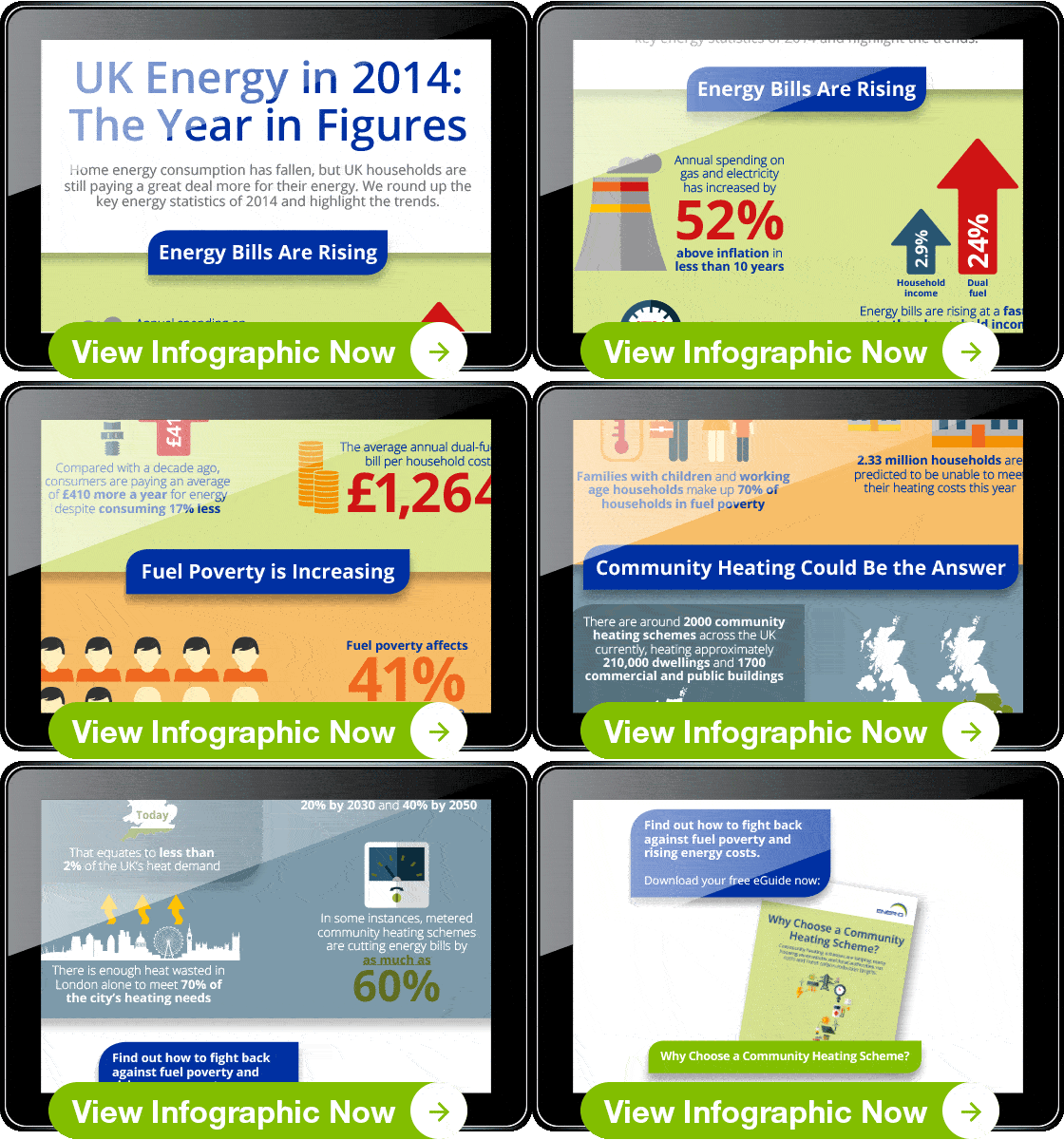
With energy prices rising and winter blackouts threatening, the story of UK energy in 2014 is all too familiar. Home energy consumption is down, but energy bills are increasing at a faster rate than household income - and as a result, the number of households in fuel poverty is up.
Fuel poverty isn’t just something experienced by the elderly and those who can’t work. Instead, the majority of those who can’t afford to heat their homes are working age households and families with children. It’s no surprise that the majority of people are worried about the costs of their home energy consumption.
In light of this energy crisis, 2014 has seen a resurgence of interest in community heating schemes as a sustainable way to fight back against fuel poverty and rising energy costs. The benefits of community heating schemes have been making the news, and the government have set targets to increase the amount of heat produced by community heating in the UK.
Read our infographic now to find out more and get the key figures behind the trends.


